Product page redesign
About
Grove opened a new acquisition channel through Google product listing ads (PLA). To create a more impactful landing page experience for visitors in the new flow, I improved the product details page (PDP) and related discovery features.
Role
Lead designer for the Growth team focusing primarily on the web platform with translations to the app. Launched 8 features over the course of 4 months.
Project outcomes
Improved add to cart (ATC), conversion (CVR), and bounce rate metrics
Experiment learnings that supported a future “subscribe and save” initiative, the company’s strategic priority for the upcoming year
Validated product solution and improved customer experience
Before
After
Grove’s vision to reach the next 10m customers
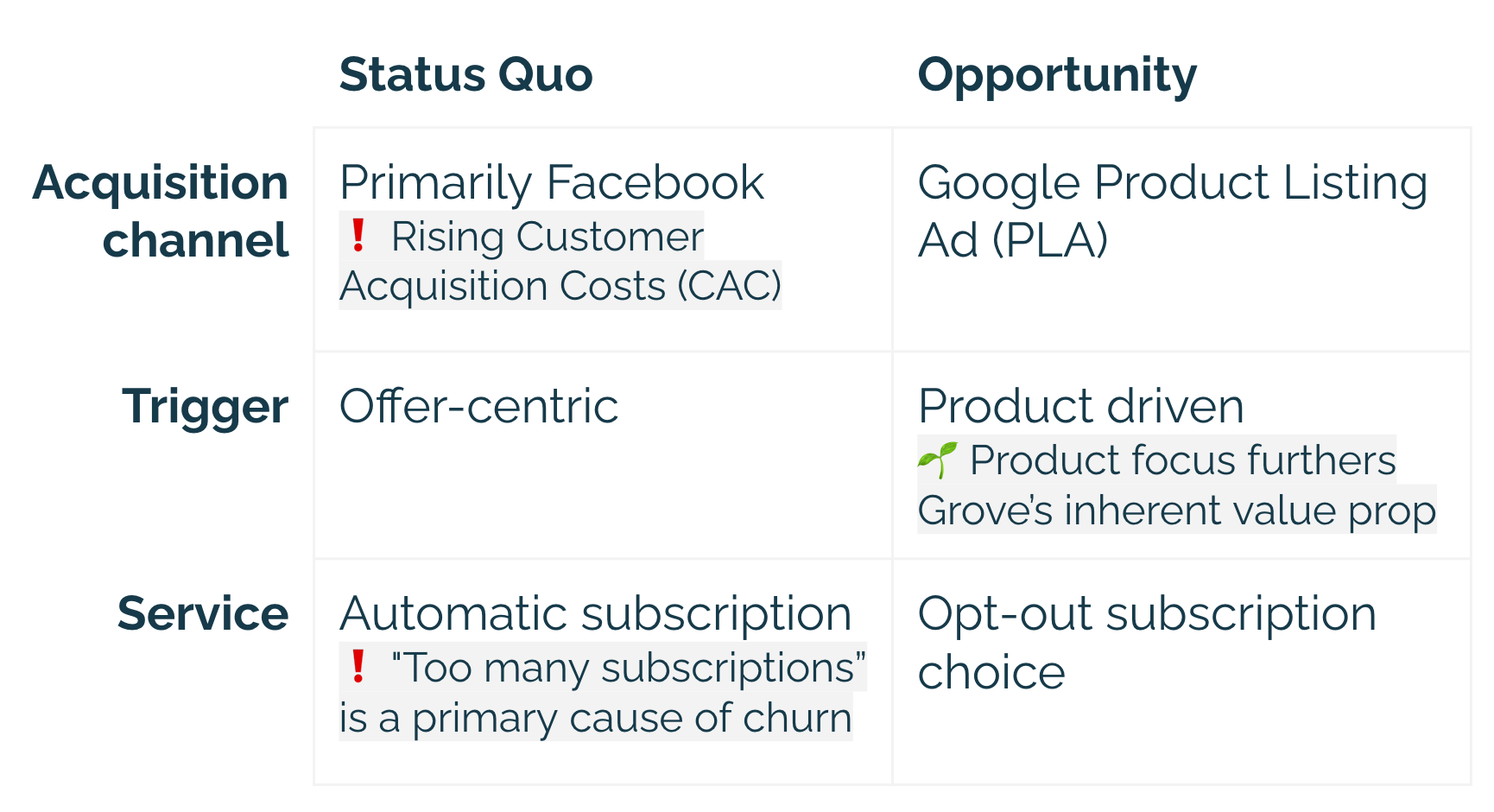
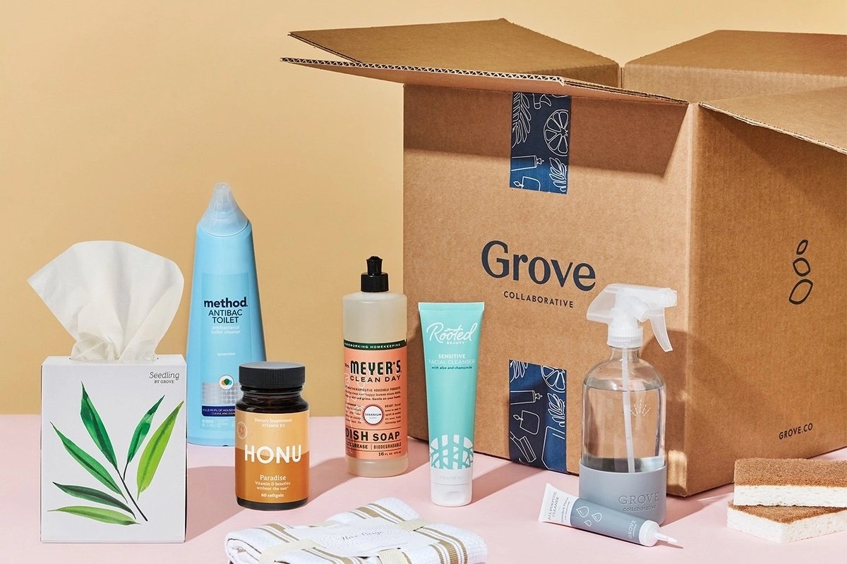
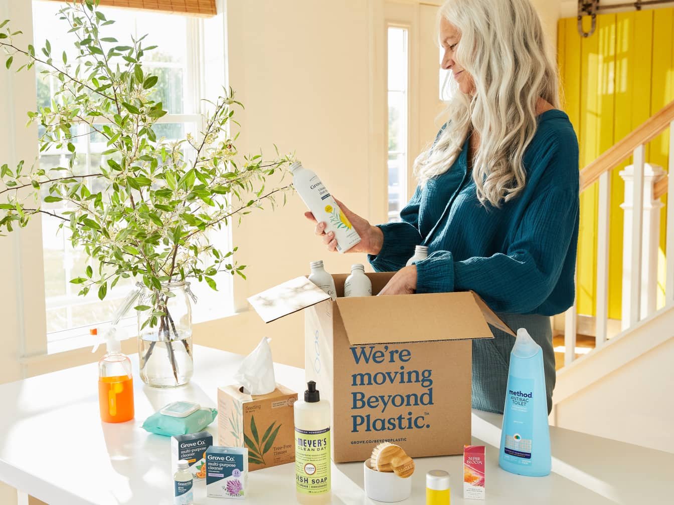
Opening the new PLA acquisition channel was a step towards Grove’s vision to reach more customers. The opportunity reduced customer acquisition costs, helped the team prioritize product value, and necessitated a no-subscription option, which appeals to a larger audience.
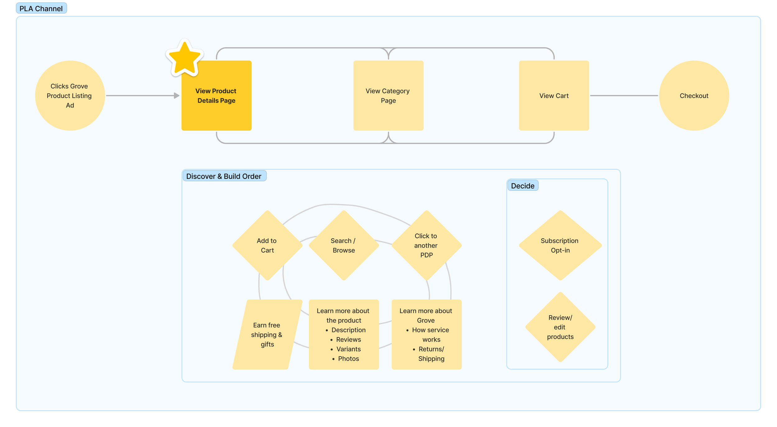
The PLA visitor is a product driven flow
Start of the customer journey:
Visitor searches for a product, type of product or product category they are looking for
Visitor clicks on a search result (Google Shopping, paid, organic)
Visitor lands on a Grove product details page (PDP)
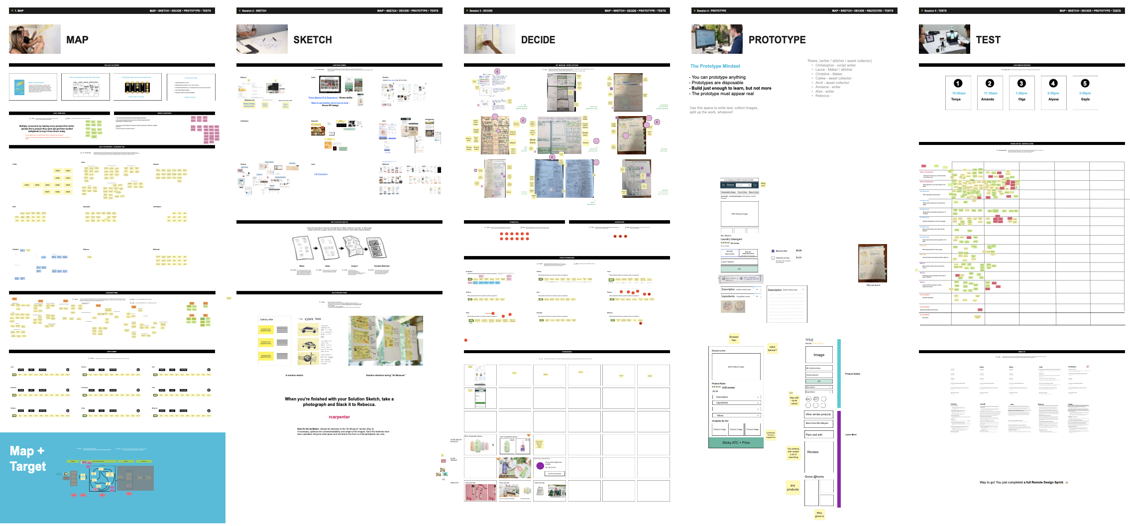
Cross-functional 5-day design sprint aligned team on PDP focus & features direction
As the design stakeholder, I participated in a 5-day design sprint for the “Product-first” space and led in areas like prototyping and synthesizing, which helped shape future PDP objectives.
PDP objectives for roadmap projects
On PDP landing, the goal was to help potential customers know that Grove:
Has the product they are looking for
Offers great value
Carry other products they might want
Feature highlights
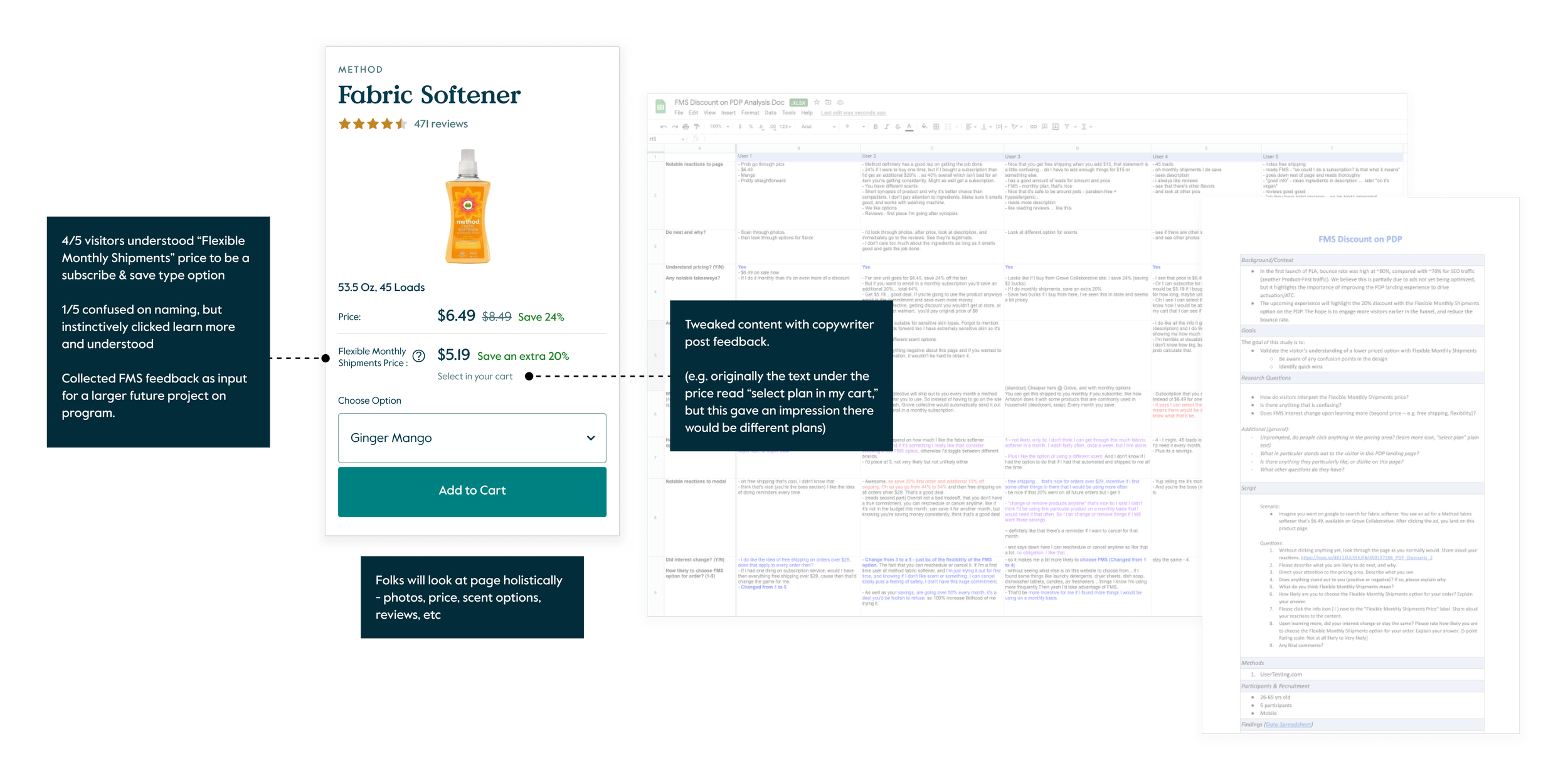
Subscription pricing
User story
As a visitor who is searching for a product, I want to know all potential discounts upon land, so that I can save money and time getting a product of interest.
Note that “Flexible Monthly Shipments” will eventually become “Subscriptions.” For this project, the constraint is a full order subscription. This will ultimately change to subscribe into specific products.
Before
After
Existing experience
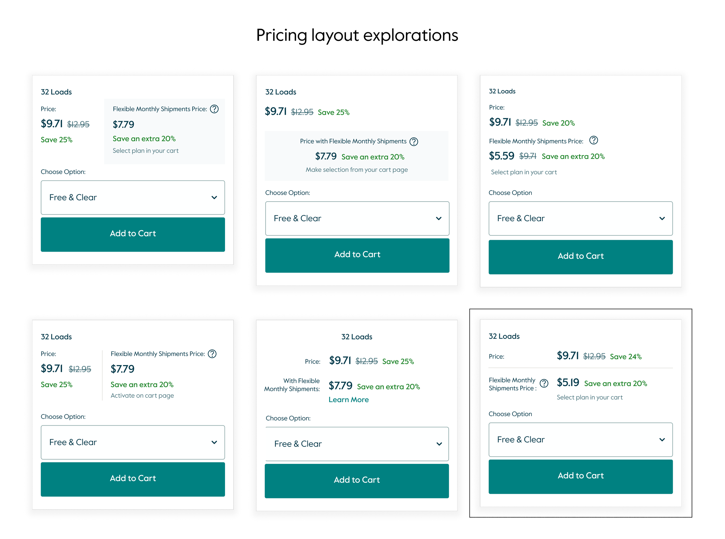
Narrowed to mid-fi test version
I conducted competitive analysis, diverged on multiple concepts, and led design critiques. I converged to the layout that allowed for the easiest comparison of price and savings. Some of my considerations:
Prioritized readability
Created “learn more” icon pattern
Aimed for simplicity and removed redundant strikethrough pricing
Consistency in label treatment vs core content
User testing validates overall design and informs short and long term improvements
Design allowed for discount amount testing that 2x the subscription opt-in rate, helping inform future business decisions on the “subscribe & save” program.
Accordion layout & carousel redesign
User story
ACCORDION - As a visitor interested in a product, I want to easily find relevant product details, so that I can make an informed purchase decision to get what I need.
CAROUSEL - As a visitor interested in a product type, I want to easily explore and compare multiple options, so that I can get the product that best fits my needs.
Before
After
Approach
I utilized prior user findings, competitive research, best practices, and adapted to our design system. I collaborated closely with engineering for ease of build, user-friendly interactions, and accessibility.
Before
After
Before
After
Before
After
Usability improvements rolled out beyond the PLA channel to the existing customer experience and app platform
Led a user testing study post overall PDP redesign
I pulse checked changes and learned how visitors continue to build their order beyond the PDP.
Reflections
Early cross-functional engagement and buy-in helps quicken the design development stage.
Working closely with PM and Eng allowed for additional small wins beyond core changes.
Investing in user testing and research, along with industry learnings help build confidence and efficiencies for the team.

