Billion acts responsive design
About
Billionacts.org is an online community of organizations and individuals promoting acts of peace in 10 focus areas. Led by Nobel Laureates, the campaign encourages users to post their acts on the billion acts website to inspire others and work towards a goal of 1 billion peace acts.
Role
As a product designer on the team design consultants collaborating with the founder and engineer partner, I worked on the end-to-end process of the responsive web re-design. This included usability testings, brainstorms, low and mid fidelity wireframes, and high fidelity assets. I focused primarily on onboarding and landing page redesign.
Objective
Increase members and acts of peace posts through improving these areas on billionacts.org:
Onboarding Network Partners and Individuals
Landing page
Creating an Act
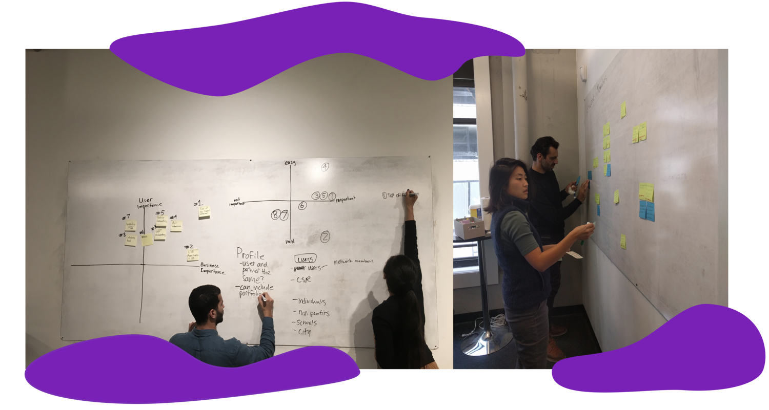
L: We utilized a 2x2 of user and business importance, as well as a 2x2 of overall importance and implementation ease to prioritize areas of focus
R: Synthesizing insights after usability tests
Two user groups
Network Partners - organizations like companies, schools, NGOs who join Billion Acts to engage their members and showcase their organization led campaigns
Individuals - solo contributors or members of organizations, like students, who are looking for acts of peace ideas and a place to showcase their own collection of acts to inspire change
With the founder, we prioritized Network Partners as the core users since organizations organically brought in more individuals, increasing overall membership and engagement.
Existing onboarding confusion for Network Partners
The current onboarding process is unclear as evident from our usability tests with organization leaders, which included teachers and HR leads. All 5 Network Partner participants did not think there was a clear pathway to sign up.
Users were confused that they needed to create an individual account before submitting their Network Partner application.
“Is this for me or my organization?”
V1 design solutions
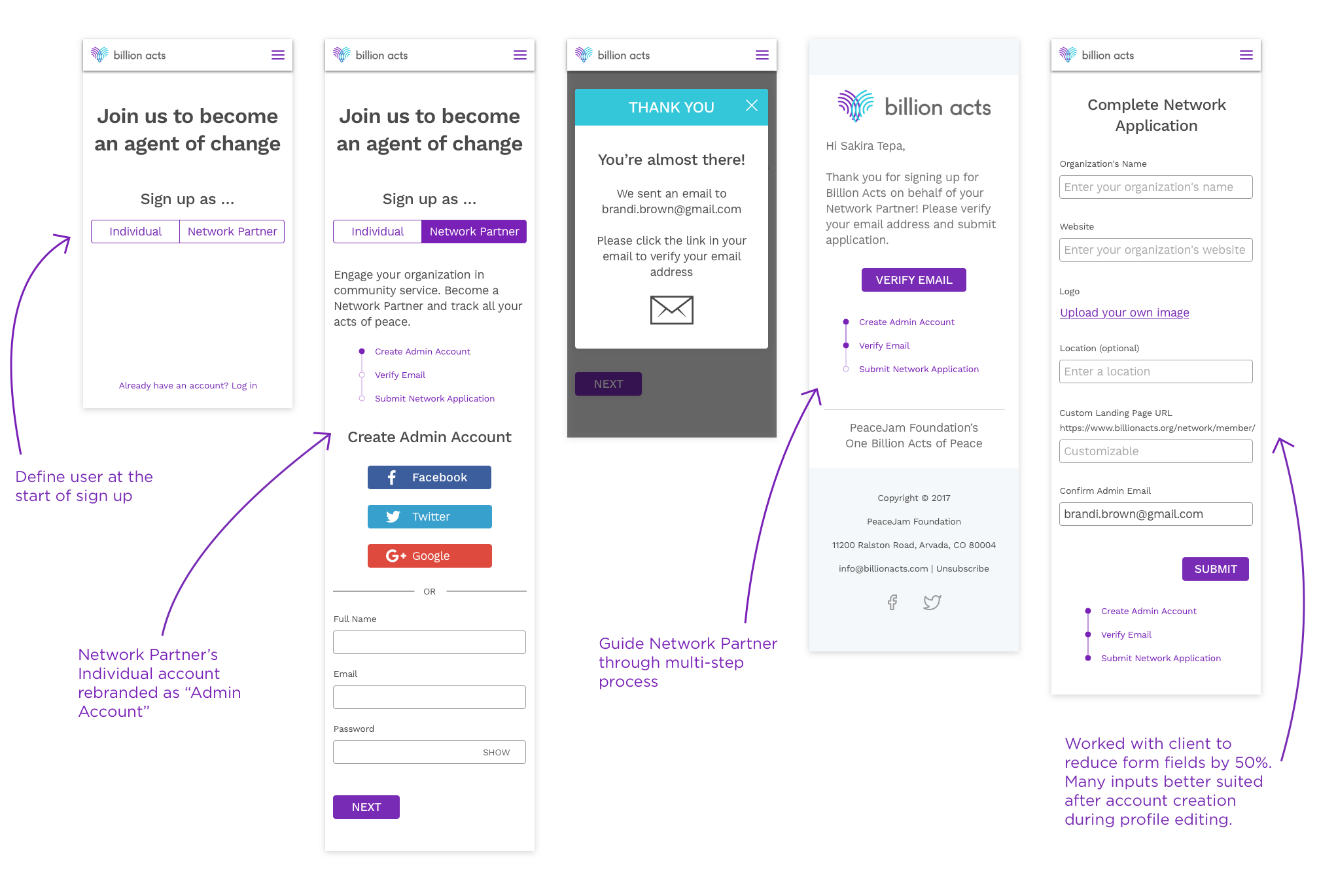
In low to mid fidelity designs we wanted to clarify the process, so we focused on the below changes
Identify user at sign up, so that during email verification all those intending to become a Network Partner land immediately on the network application page
Clarify the multi-stage process for network partners
Reduce friction by simplifying the form
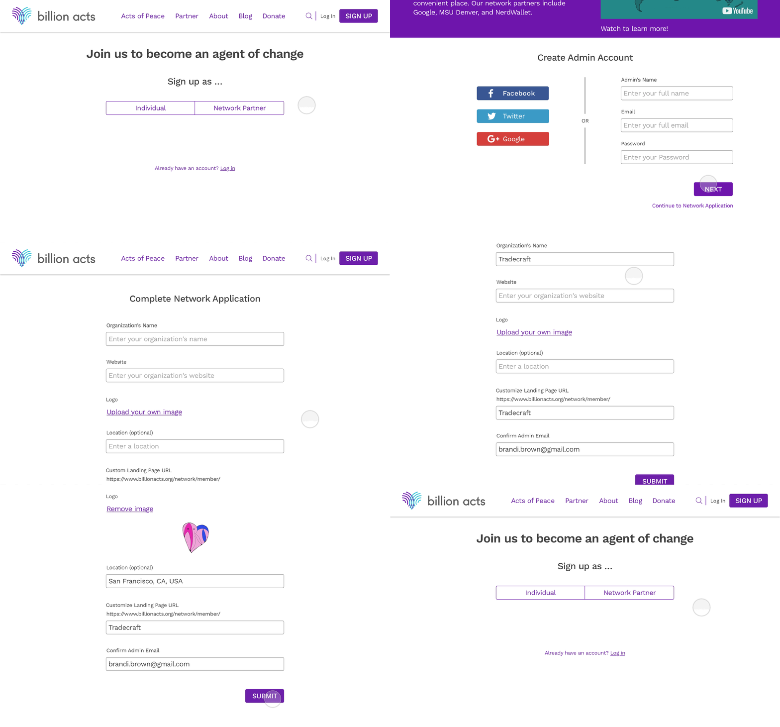
Usability feedback led to further iterations
Changes included:
Streamlining the process, so that users create their admin account and partner application before verifying their email. This eliminated the need for users to return back to the site to submit their application.
Getting rid of the progress bar, which based on feedback, cluttered the page in the initial designs.
“Why do I have to create an account at the beginning, verify, and then go back to the site to submit a Network Partner form?”
Value proposition opportunity on landing page
Throughout design sprints, we resolved to address these user concerns on the landing page:
What's an act of peace? I want to see examples…
Why should I get involved?
What are the benefits for organizations?
We designed in an iterative process that involved time-boxed brainstorms, low and mid fidelity designs, prototypes, and user testings.
Revamping the landing page
Navigation bar changes
Removed the secondary dropdown
Surfaced key sections like Acts of Peace, Partner, and Blog
Created a more accessible donate and search function
Emphasized sign up as primary CTA
Learnings
Meeting weekly with the founder and engineers throughout the project improved our design process. For example, changes in the onboarding flows would affect the backend organization of members. Discussing concerns and regularly presenting design changes with the whole Billion Acts team developed a collaborative and efficient environment.


